Personalized Bicycle Rental App —
Design Case Study

Cyclo is a personalized bicycle-rental app design. It has quick and safe routes for cycling, and alternate longer routes for an extreme workout.
The case study provides a complete experience, from booking the bicycle, till the end of the trip, including the riding experience. Having used such apps myself, I knew the exact pain points that needed to be addressed. Read on to find out the ways in which I have solved such problems.
Research and Problem Statements
- The apps for booking bicycles today have a faulty location system.
Finding a nearby cycle stands is difficult, and the way to reach them
from the current location is not ideal. There is also no indication of the
closest station based on distance. The user needs to figure this out
by looking at the mere pins on the map - People driving cars or riding motorcycles do not really pay heed to the
cyclists on the road. This can be dangerous for a bicycle rider.
The routes shown on the map are not cycle friendly - In current bicycle apps, the user is not notified or reminded about parking
the cycle at the station at the end of a trip. This can cause the user to forget
parking the cycle immediately after the trip. This will result in the cycle
charges to increase even after the trip end - Incoming calls during the bicycle ride disturb the navigation.
The call notification takes over the entire screen, making it difficult to
see the map - Cycling is not just easy to commute. It can also become a means of leading a healthier life. That’s the aspect we are looking at for our user.
It is using reward psychology to not just make our users cycle more,
but also use our app for frequent cycling since other apps do not focus
on the health aspect so much
Features designed to overcome Problems
- Showing nearby bicycle stations smartly, using big data and machine-learning algorithms
- Seamless Navigation Experience from current location to cycle station (to pick the cycle)
- Highly conversational UI to give the user reward-system like experience
- Notifying the user about nearby cycle stand (to drop the cycle) towards the end of the trip
- Smartly integrating app systems to avoid distraction (eg. calls) in navigation
The UI Flow
Finding your Bicycle — Cyclo’s UI has clear indicators, showing different cycles which are nearby with the exact distance and duration to reach the cycle.
It also shows the rates, you can click on the cycle and get details about it. Once you decide which cycle you choose to go with you can click on the rent bike option.
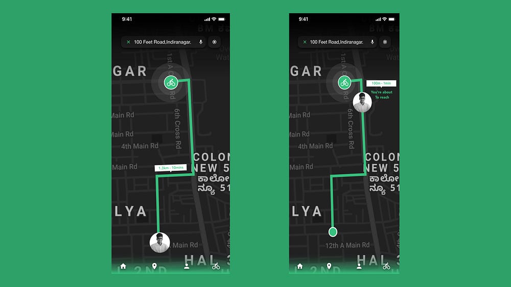
Navigation to bicycle — The screen shows the walking route to the cycle.
The remaining duration to reach the cycle.
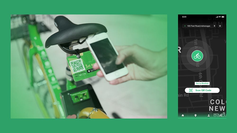
On Reaching — For the security of bicycles, we use QR codes as the locking mechanism. When the user reaches the station, a button pops at the bottom informing the user to scan the QR code on the cycle to unlock it.
On tapping the QR scan button, the camera turns on for the user to
scan the code. There is also a button at the bottom to turn on the flash for a clear picture.
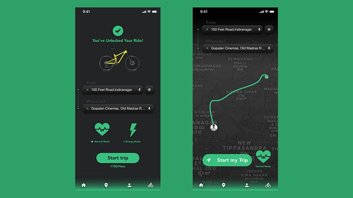
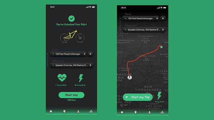
Navigation Mode — Once the cycle is unlocked, the user enters the destination in the app. User needs to choose a mode — Normal Mode or Energy Mode.
The navigation begins once the user taps on ‘Start my Trip’ button.

In-App Notifications —
Rewards — Every time the user loses 100 Calories, there is a small pop-up notifying the user about the milestone. This can be motivating and acts as a reward system for the user to burn more calories.

In-App Notifications —
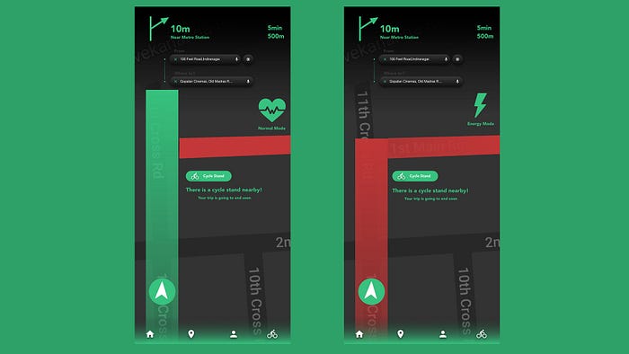
Nearby cycle stands — Towards the end of a trip, the user is notified about the nearby cycle stations where they can park the bicycle.
In-App Notifications —
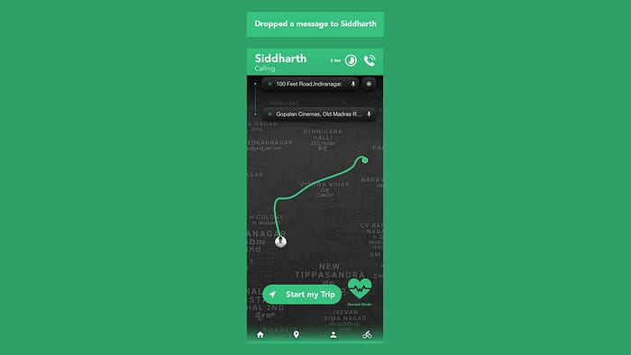
Call Notification and Auto-send SMS — The background processes are frozen to avoid interruption with the trip. The call notifications are restricted to the top bar only, avoiding the distraction from the navigation. There is a countdown timer of 10sec during which if the user doesn’t pick the call, an automatic SMS will be sent to the caller, notifying them that the user is riding a bicycle and cannot attend the call at the moment. This SMS can be a default one or customized by the user. The user will have the option to do this while on-boarding, or from the Settings menu.
End of the trip —
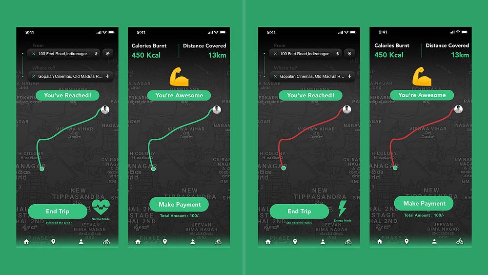
When the user reaches the destination, they can choose to end the trip
and make payment by clicking on End my Trip button. This will take the user to the page displaying the distance covered in the trip and calories burnt in the process. The amount to be paid will be shown at the bottom, with a button to make the payment, tapping on which will take the user to the payment gateway. If the user wishes to keep the bicycle for more trips in the day, they can tap the button called ‘Still need the cycle’. This will take the user to the screen where the destination has to be entered.
Future Scope —
This app can be extended for the tourist crowd by adding features like showing nearby attractions (eg. cafes, restaurants, malls, etc.). When a tourist visits a city, they don’t know much about their way through the city. And so, the Normal Mode will be primarily inherited for tourists to show direct and safe routes for an easy commute.